Goal
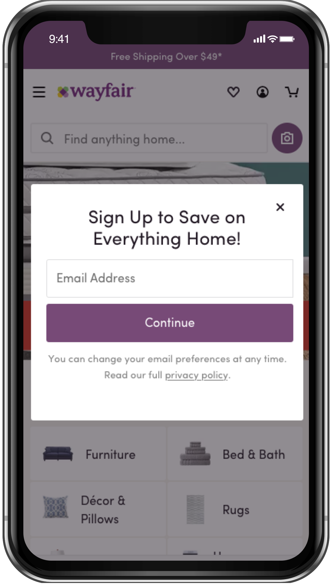
When new users come to Wayfair.com for the first time, they are presented with an email capture field. Acquiring email addresses allows Marketing to communicate with users individually and hopefully lead improved conversion and CLV.
Since all users see this modal at the beginning of their journey, it's one of Wayfair's most visible features. The goal of this project was to come up with a multi-variant test to see if a new mobile design would increase engagement with the input field.
Scope
In order for this to be a controlled test, it was important that certain design elements persisted from version to version. Having fewer variables would produce cleaner test results so the team could see what actually moved the needle.
My Role
I lead design on this project and provided several options for testing. I worked closely with Product, Marketing and Analytics to develop designs and a controlled, multi-variant testing plan. Since the Marketing team had a large stake in collecting email addresses, they were heavily involved in the design process. I conducted several design studios with the cross-functional team to gather requirements and narrow down options.
The Team
My Team:
- Design Lead: Me
Cross-Functional Partners:
- Product Management
- Front-End Dev
- Analytics
- Marketing
Stakeholders:
- Marketing
Approach
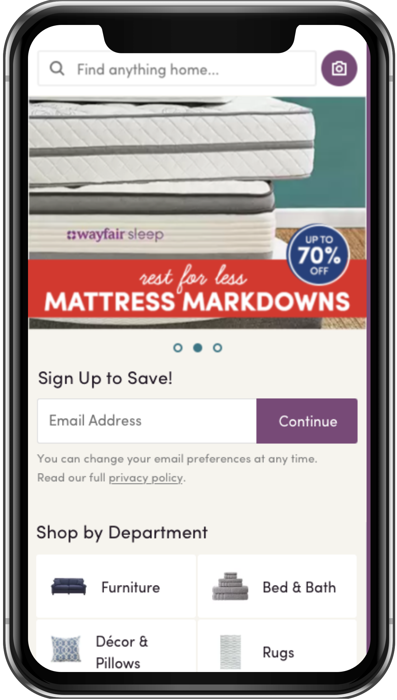
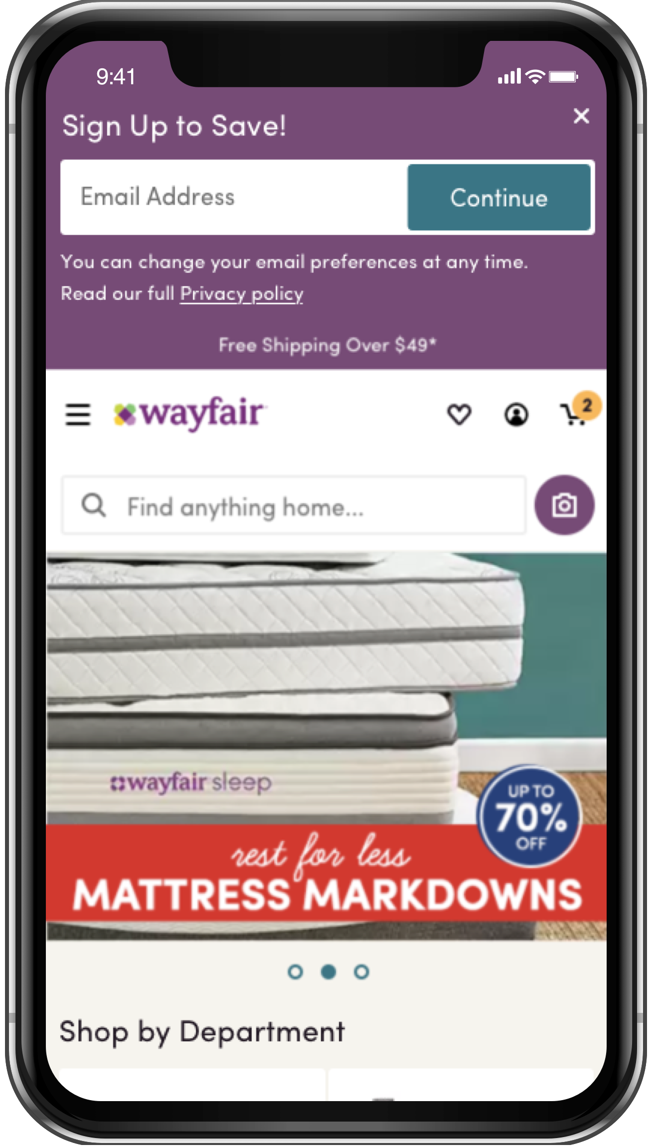
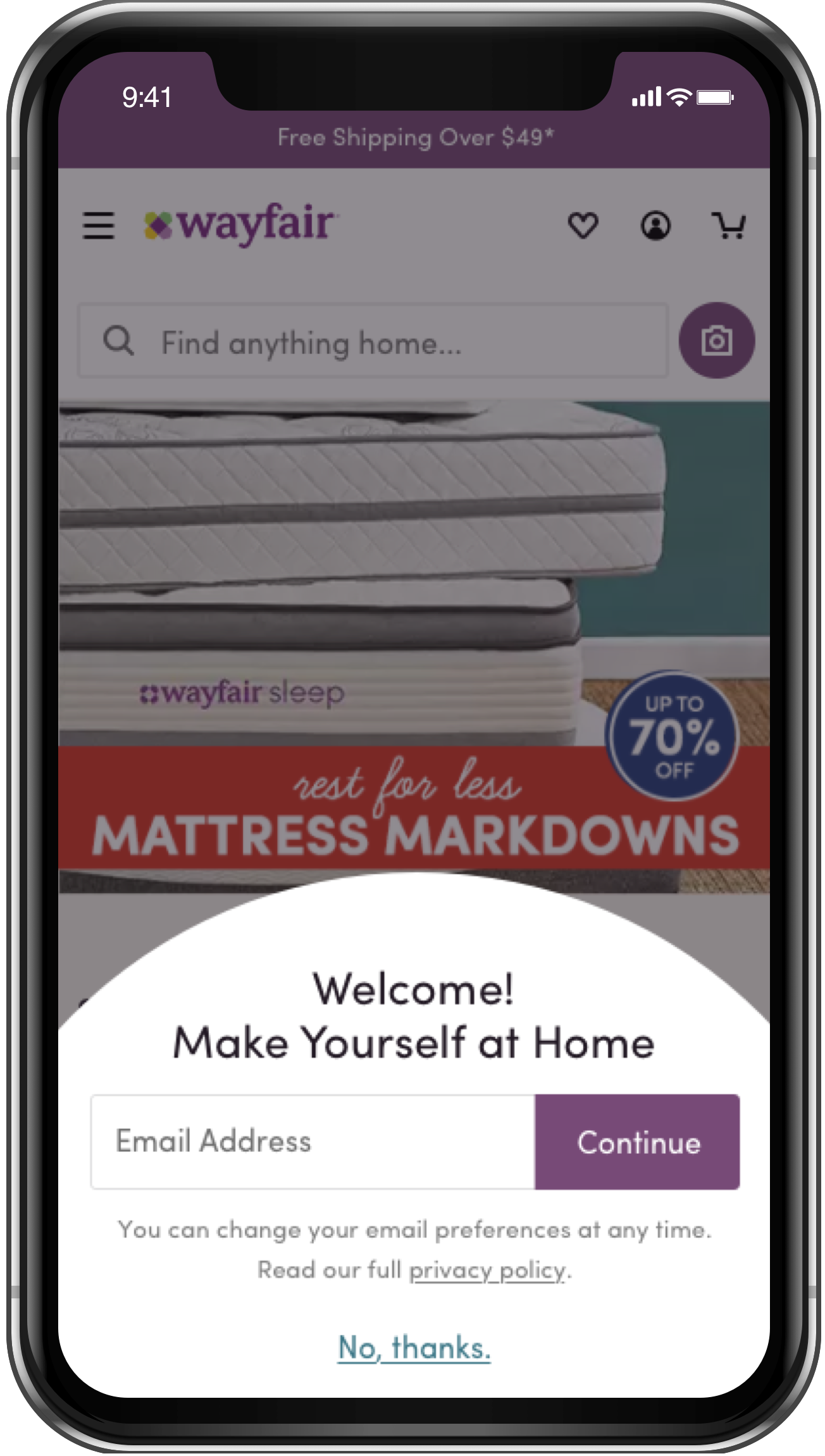
This project was kicked off with slim requirements, so I collaborated with my team to better define these. Once there was agreement, I began exploring what could be done with design. I came up with 3 options — some tested UI and some tested UX by integrating the form into existing pages like the homepage.
Challenges
- Aligning with the Marketing team
- Navigating prescriptive feedback
- Collaborating to determine requirements
- Designing a controlled test
- Reusing components from our UI library
Outcome
Since this feature receives so much traffic, the test only had to be live for a few weeks before a winner was determined. Option 3 (a UI improvement) ended up winning which wasn't necessarily a surprise. The team had tested a similar, circular design on desktop and that version ended up winning there as well.